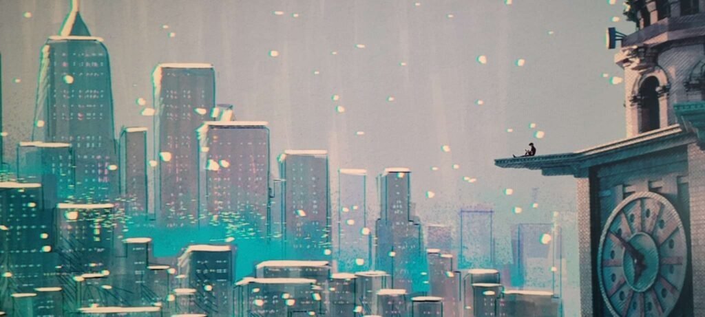
This post is going to be the beginning of a master copy series that I normally do in my journal. Since this is technically a journal for me now, I will do it here. I want to talk about Spiderman Across the Spiderverse. I finally got around to watching this film and I am upset it took me so much time to study it. I found myself spending so much time in awe and then more time taking photos of each scene so I can study it later. This initial shot captivated me for so long. The amazing balance of detail, fantastical, realism, and mood. It clearly shows that if you have set up a good hierarchy, the image will be easy to create. The set up looks like a rules of third grid and the muted color palette sets the tone for the entire scene. We can see Miles contemplating the vast weight of their decisions in life and the adventure that awaits them. During this part of the movie, Miles is very lonely and in need of community, the scene reflects the mood with muddled grays and somber blue tones. What I find interesting is that the city is showing the blue, while the sky is grey. This could mean that Miles must spend their life looking toward the city, not the clouds. The artists for the film were in the thousands as they tackled such an innovative and remarkable feat of animation.
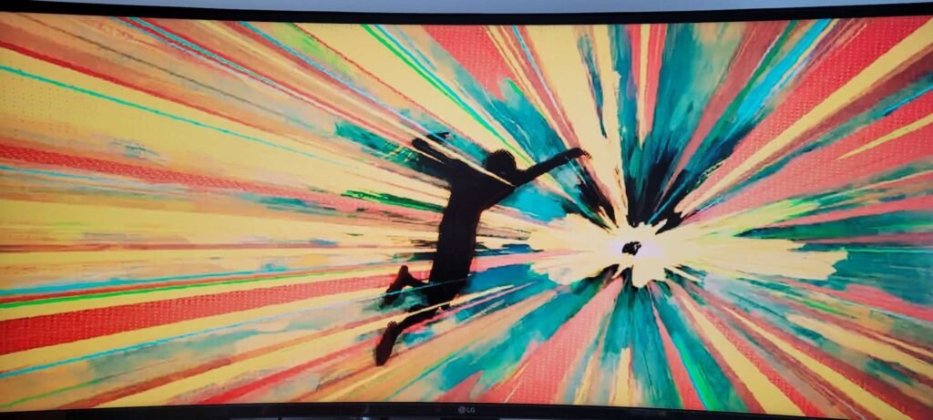
When we look at what we do as artists, designers, and developers, we must always look to the fantastical for inspiration for our craft. This movie was created and shared by so many, and we have every frame to study because of it. In this frame, Miles enters the fray. This is the Joseph Campbell leap into adventure for the main character, to the unknown. We see a clear grid and Miles hold equal weight to the end of the portal.
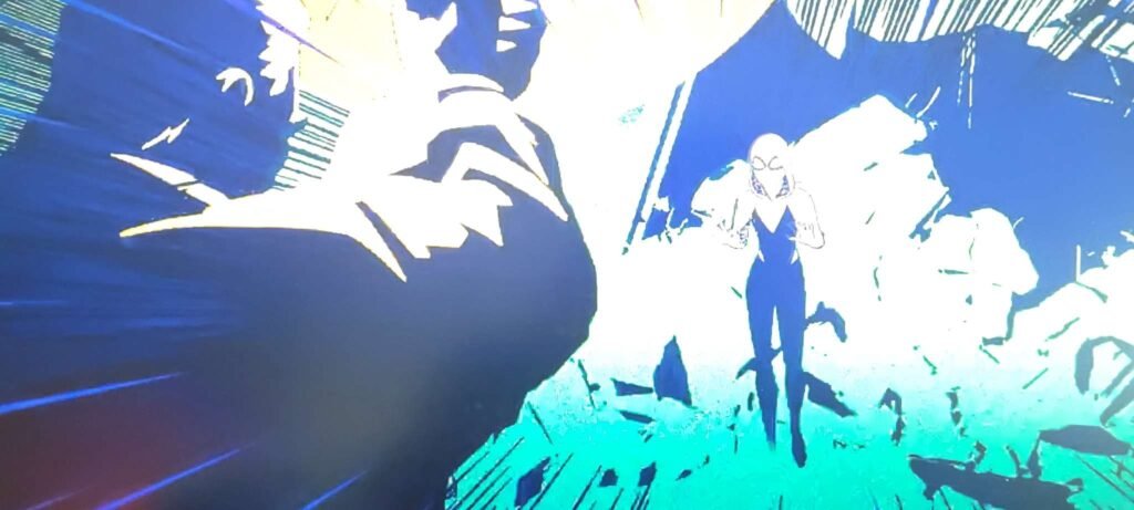
This took me several attempts to capture. The sudden burst of bright light allows for no midtones to exist in this shot. One of the best principles of color theory is to use black, white, and one color. It is a bold spread and emphasizes drama.
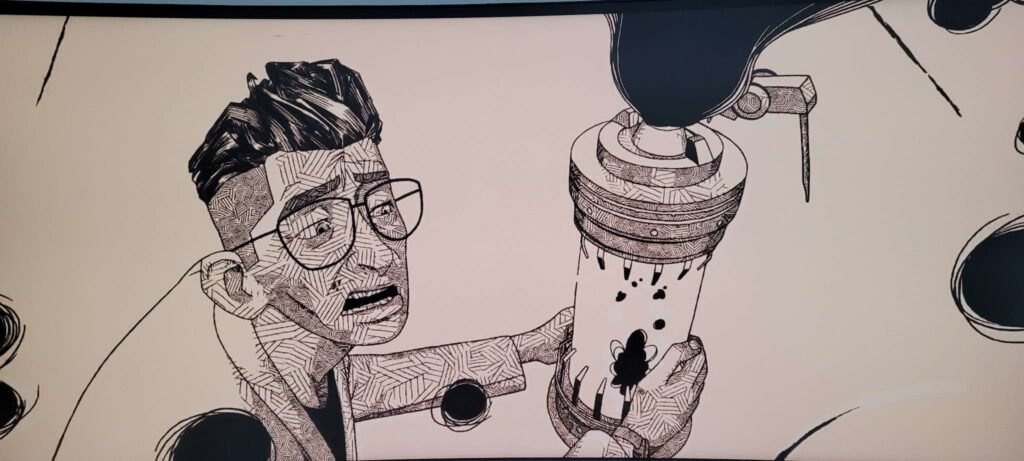
Here we can see a shot devoid off all color, and the use of texture to provide the viewer with depth. An artist must know many techniques to have options. An artist must then add constraints to their project because constraints are what help us focus our cognitive bandwidth for decision making. I use to have a huge issue with this, but after many years of study, I have learned to love constraints.
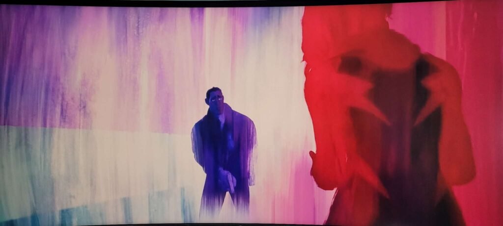
This shot provides such contrast and beautiful textures. Color can communicate so much without any use of language.
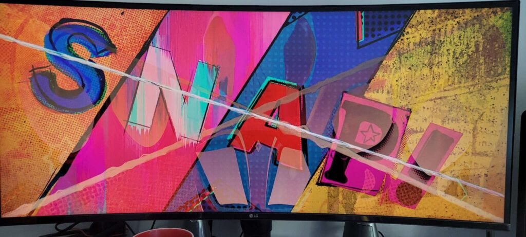
While this shot shows that we don’t even need animation when a word can do it for us. We all must understand that typography is our language visualized. It is the best tool for use to communicate across many platforms. This example may be in English, but the intensity is there. The diagonal lines, the brush strokes, and the image of Spiderman’s sorrow conveys everything that is needed for the shot to be amazing.
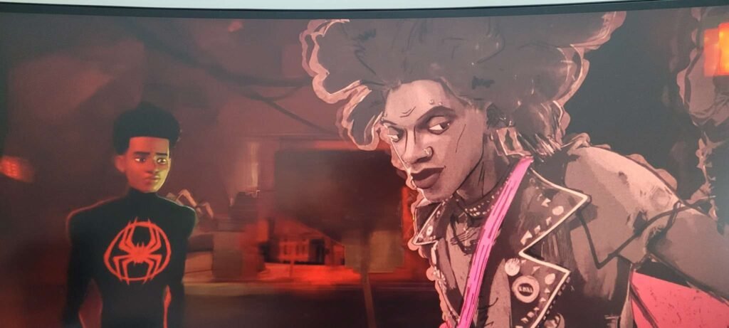
Here we have a fantastic use of contrast. Hobie and Miles are clearly from different worlds and yet they are the same. The fantastic design of Hobie shows a character that is rich in design.
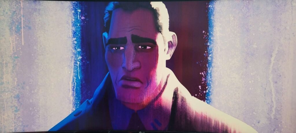
Another great frame. Gwen’s father is wrestling with the weight of parenthood, and the frame conveys so much. The fantastical merging into realism.

This film is such a great tool for study. I will be pouring my thoughts over each frame I collected for many years to come. I hope that I can provide the world with something that will be enjoyed, and beloved as much as this film.